Archive

Science 2.0

Note: This is a reblog from the OKFN Science Blog.

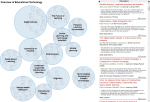
It’s hard to believe that it has been over a year since Peter Murray-Rust announced the new Panton fellows at OKCon 2013. I am immensly proud that I was one of the 2013/14 Panton Fellows and the first non UK-based fellow. In this post, I will recap my activities during the last year and give an outlook of things to come after the end of the fellowship. At the end of the post, you can find all outputs of my fellowship at a glance. My fellowship had two focal points: the work on open and transparent altmetrics and the promotion of open science in Austria and beyond.

Open and transparent altmetrics

Peter Kraker on stage at the Open Science Panel Vienna (Photo by FWF/APA-Fotoservice/Thomas Preiss)

On stage at the Open Science Panel Vienna (Photo by FWF/APA-Fotoservice/Thomas Preiss)

The blog post entitled “All metrics are wrong, but some are useful” sums up my views on (alt)metrics: I argue that no single number can determine the worth of an article, a journal, or a researcher. Instead, we have to find those numbers that give us a good picture of the many facets of these entities and put them into context. Openness and transparency are two necessary properties of such an (alt)metrics system, as this is the only sustainable way to uncover inherent biases and to detect attempts of gaming. In my comment to the NISO whitepaper on altmetrics standards, I therefore maintained that openness and transparency should be strongly considered for altmetrics standards.

In another post on “Open and transparent altmetrics for discovery”, I laid out that altmetrics have a largely untapped potential for visualizaton and discovery that goes beyond rankings of top papers and researchers. In order to help uncover this potential, I released the open source visualization Head Start that I developed as part of my PhD project. Head Start gives scholars an overview of a research field based on relational information derived from altmetrics. In two blog posts, “New version of open source visualization Head Start released” and “What’s new in Head Start?” I chronicled the development of a server component, the introdcution of the timeline visualization created by Philipp Weißensteiner, and the integration of Head Start with Conference Navigator 3, a nifty conference scheduling system. With Chris Kittel and Fabian Dablander, I took first steps towards automatic visualizations of PLOS papers. Recently, Head Start also became part of the Open Knowledge Labs. In order to make the maps created with Head Start openly available to all, I will set up a server and website for the project in the months to come. The ultimate goal would be to have an environment where everybody can create their own maps based on open knowledge and share them with the world. If you are interested in contributing to the project, please get in touch with me, or have a look at the open feature requests.

Evolution of the UMAP conference visualized in Head Start. More information in  Kraker, P., Weißensteiner, P., & Brusilovsky, P. (2014). Altmetrics-based Visualizations Depicting the Evolution of a Knowledge Domain 19th International Conference on Science and Technology Indicators (STI 2014), 330-333.

Evolution of the UMAP conference visualized in Head Start. More information in Kraker, P., Weißensteiner, P., & Brusilovsky, P. (2014). Altmetrics-based Visualizations Depicting the Evolution of a Knowledge Domain 19th International Conference on Science and Technology Indicators (STI 2014), 330-333.

Promotion of open science and open data

Regarding the promotion of open science, I teamed up with Stefan Kasberger and Chris Kittel of openscienceasap.org and the Austrian chapter of Open Knowledge for a series of events that were intended to generate more awareness in the local community. In October 2013, I was a panelist at the openscienceASAP kick-off event at University of Graz entitled “The Changing Face of Science: Is Open Science the Future?”. In December, I helped organizing an OKFN Open Science Meetup in Vienna on altmetrics. I also gave an introductory talk on this occasion that got more than 1000 views on Slideshare. In February 2014, I was interviewed for the openscienceASAP podcast on my Panton Fellowship and the need for an inclusive approach to open science.

In June, Panton Fellowship mentors Peter Murray-Rust and Michelle Brook visited Vienna. The three-day visit, made possible by the Austrian Science Fund (FWF), kicked off with a lecture by Peter and Michelle at the FWF. On the next day, the two lead a well-attended workshop on content mining at the Institute of Science and Technology Austria.The visit ended with a hackday organized by openscienceASAP, and an OKFN-AT meetup on content mining. Finally, last month, I gave a talk on open data at the “Open Science Panel” on board of the MS Wissenschaft in Vienna.

I also became active in the Open Access Network Austria (OANA) of the Austrian Science Fund. Specifically, I am contributing to the working group “Involvment of researchers in open access”. There, I am responsible for a visibility concept for open access researchers. Throughout the year, I have also contributed to a monthly sum-up of open science activities in order to make these activities more visible within the local community. You can find the sum-ups (only available in German) on the openscienceASAP stream.

I also went to a lot of events outside Austria where I argued for more openness and transparency in science: OKCon 2013 in Geneva, SpotOn 2013 in London, and Science Online Together 2014 in Raleigh (NC). At the Open Knowledge Festival in Berlin, I was session facilitator for “Open Data and the Panton Principles for the Humanities. How do we go about that?”. The goal of this session is to devise a set of clear principles which describe what we mean by Open Data in the humanities, what these should contain and how to use them. In my role as an advocate for reproducibility I wrote a blog post on why reproducibility should become a quality criterion in science. The post sparked a lot of discussion, and was widely linked and tweeted.

by Martin Clavey

by Martin Clavey

What’s next?

The Panton Fellowship was a unique opportunity for me to work on open science, to visit open knowledge events around the world, and to meet many new people who are passionate about the topic. Naturally, the end of the fellowship does not mark the end of my involvement with the open science community. In my new role as a scientific project developer for Science 2.0 and open science at Know-Center, I will continue to advocate openness and transparency. As part of my research on altmetrics-driven discovery, I will also pursue my open source work on the Head Start framework. With regards to outreach work, I am currently busy drafting a visibility concept for open access researchers in the Open Access Network Austria (OANA). Furthermore, I am involved in efforts to establish a German-speaking open science group

I had a great year, and I would like to thank everyone who got involved. Special thanks go to Peter Murray-Rust and Michelle Brook for administering the program and for their continued support. As always, if you are interested in helping out with one or the other project, please get in touch with me. If you have comments or questions, please leave them in the comments field below.

All outputs at a glance

Head Start – open source research overview visualization
Blog Posts
Audio and Video
Slides
Reports
Open Science Sum-Ups (contributions) [German]

Note: This is a reblog from the OKFN Science Blog. As part of my duties as a Panton Fellow, I will be regularly blogging there about my activities concerning open data and open science.

In July last year, I released the first version of a knowledge domain visualization called Head Start. Head Start is intended for scholars who want to get an overview of a research field. They could be young PhDs getting into a new field, or established scholars who venture into a neighboring field. The idea is that you can see the main areas and papers in a field at a glance without having to do weeks of searching and reading.


Interface of Head Start

You can find an application for the field of educational technology on Mendeley Labs. Papers are grouped by research area, and you can zoom into each area to see the individual papers’ metadata and a preview (or the full text in case of open access publications). The closer two areas are, the more related they are subject-wise. The prototye is based on readership data from the online reference management system Mendeley. The idea is that the more often two papers are read together, the closer they are subject-wise. More information on this approach can be found in my dissertation (see chapter 5), or if you like it a bit shorter, in this paper and in this paper.

Head Start is a web application built with D3.js. The first version worked very well in terms of user interaction, but it was a nightmare to extend and maintain. Luckily, Philipp Weißensteiner, a student at Graz University of Technology became interested in the project. Philipp worked on the visualization as part of his bachelor’s thesis at the Know-Center. Not only did he modularize the source code, he also introduced Javascript Finite State Machine that lets you easily describe different states of the visualization. To setup a new instance of Head Start is now only a matter of a couple of lines. Philipp developed a cool proof of concept for his approach: a visualization that shows the evolution of a research field over time using small multiples. You can find his excellent bachelor’s thesis in the repository (German).


Head Start Timeline View

In addition, I cleaned up the pre-processing scripts that do all the clustering, ordination and naming. The only thing that you need to get started is a list of publications and their metadata as well as a file containing similarity values between papers. Originally, the similarity values were based on readership co-occurrence, but there are many other measures that you can use (e.g. the number of keywords or tags that two papers have in common).

So without further ado, here is the link to the Github repository. Any questions or comments, please send them to me or leave a comment below.


Today, I am happy to announce that Head Start, my overview visualization of Educational Technology has been released on Mendeley Labs. The visualization is intended to give researchers that are new to a field a head start on their literature review (hence the name).

When you fire up the visualization, the main areas in the field are shown, represented by the blue bubbles. Once you click on a bubble, you are presented with the main papers in that area. The dropdown on the right displays the same data in list form. By clicking on one of the papers, you can access all metadata for that paper. If a preview is available, you can retrieve it by clicking on the thumbnail in the metadata panel. By clicking on the white background, you can then zoom out and inspect another area. Go ahead and try it out!

The visualization was created with D3.js. It has been successfully tested with Chrome 22, Firefox 15, and Safari 5.1. Unfortunately, Internet Explorer and Opera are not supported at this point.

Head Start is based on readership co-occurrence. I wrote several blogposts in the past that describe the ideas behind it. You can find them here, here, and here. There is also a paper from the LSNA workshop, which co-authored with Christian Körner, Kris Jack, and Michael Granitzer. I will write another post about the inner workings of the visualization in the near future. Until then, I am looking forward to your comments and feedback!

My secondment at Mendeley is drawing to a close. In the last few weeks, I have been mainly working on a running prototype of the overview visualizations of research fields. The idea is to give people who are new to a field a head start in their literature search. Below you can see a first screenshot of the prototype for the field of Educational Technology. The blue bubbles repesent the different research areas in Educational Technology. Shining through these bubbles are the most important papers in these areas. The papers become fully visible upon zooming into the area, and you can even access the paper previews within the visualization. I hope to get the prototype up and running in the next two weeks, so you can explore the visualization for yourself.

And now for something completely different

Well, at least partially different. If you are a researcher, you will have encountered the following situation: you are working on a project when you suddenly find out that someone has done exactly the same thing as you but 5(0) years earlier. Even though you have done an extensive literature review, that particular paper or project has escaped your search. There are certain reasons why something like that might happen. One is that terminology is very fluent in research; even within the same field names can change pretty quickly. This is the reason why I rely on structural data (co-readership patterns) rather than textual data (e.g. keywords, titles, abstracts) to create my visualizations. Structural data has proven to be a lot more stable over time. Much like an individual researcher usually not only searches for literature but also follows references and incoming citations to find related research.

Another reason for previous research going unnoticed is that the research was done in another community or research field. In that case, not only the terminology might be different, but also the link between the two areas may be inexistent. Ever since I started with these visualizations, I thus wanted to not only show the borders of research areas, but also their overlaps.

A semantic approach

The idea to use semantics arose when I had the problem to come up with a mechanism for automatically naming the research areas. I ended up sending the abstracts and titles from each area to OpenCalais and Zemanta. Both services crawl the semantic web and return a number of concepts that are describing the content. I use this information to find the most appropriate  name for the area. I compare the concepts that I get back to word n-grams. The more words a concept has, and the more often it occurs within the text, the more likely it is to be the name of the area.

Now I would like to use the concepts that I get back from the webservices to show connections between research areas. Using semantic reasoning, it should be possible to show overlapping research areas by common concepts. The number of common concepts could be an indicator of the size of the overlap. If there was some kind of concept classification involved, it would also be possible to give hints not only on the extent of the overlap, but also on the nature of the overlap. Are two areas using the same methodes, or are they working on similar topics? Which areas have similar theoretical backgrounds, or similar problems to solve?

This is still in a very early stage, but I am eager to get feedback on the idea. What do you think about involving semantics in that kind of way? What are other potential uses of a semantic description of research fields?

Two weeks ago, I had the pleasure of moderating the Special Track on Research 2.0 at i-KNOW 2012. It was now the third year that we had a Research 2.0 themed track at i-KNOW. Counting in the two workshop at the European Conference on Technology Enhanced Learning (EC-TEL) in 2009 and 2010, this was the fifth installment of its kind. For the second time, the special track was collaboration of the STELLAR Network of Excellence and the Marie Curie project TEAM.

In the latest edition, we had a wide papers on a variety of subjects. But the track was not only diverse in terms of topics, but also in terms of geography. The authors and speakers came from Belgium, Canada, the US, the UK, Germany, and Austria. At this point, I would like to thank our excellent program committee. These fine people not only helped us in reviewing the submissions but also spread the word of the event far beyond our own circles. So what happened in the special track?

Session 1

Erik Duval (pictured above) from KU Leuven started the day with an inspiring keynote. He talked about analytics in research, and how we need tools to manage the exponential growth of knowledge in research. He presented several tools developed at KU Leuven, such as TiNYARM (This is Not Yet Another Reference Manager), a social reading application, More!, a mobile conference application, and visualizations of scientific papers for a tabletop. For all the details, check out his presentation on Slideshare.

Next up was Marta Sabou from MODUL University Vienna, who presented a paper on crowdsourcing in (NLP) research. She talked about different crowdsourcing approaches in research along the dimensions of time, genre, and steps in the research process. She then laid out how crowdsourcing has revolutionised NLP research in terms of cost and diversification of the research agenda. She finished with the challenges that arise from this new research methodology. More can be found in her presentation on Slideshare.

In the following talk, Aida Gandara from the Cyber-Share Center of the University of Texas at El Paso presented an infrastructure that supports researchers in documenting and sharing scientific research on the semantic web. The infrastructure follows a methodology that emphasizes the need for documentation during the whole research process, not only when a research cycle has ended. The infrastructure is currently used by a number of teams which collaboratively document their research in it.

Session 2

After the lunch break, Daniel Bahls continued on the notion of the semantic web. Their paper, however, focuses on the field of economics. He discussed an approach for representing statistical data from empirical research in a semantic form. Afterwards, he showed prototypes that build on this approach, and allow for recommendation in user assistance in evaluating datasets. He concluded with the outlook that open data is a prerequisite for open science, but that it also needs methodological information in order to reproduce research results.

Orland Hoeber returned to the topic of analytics in the following talk. He presented a system for scholarly search which is enhanced by metadata visualization. Among these visualizations are a histogram of the most frequent keywords in the search results, as well as a bow tie representation of citation metadata. The latter is an innovatve way of conveying citation patterns to users. The focus is on integrating the visualizations in the search and exploration process as seamless as possible. For all details, see the paper.

The second session was concluded by two practical demos. First off, Christian Voigt from the Centre for Social Innovation and Adam Cooper from the University of Bolton introduced a roadmapping methodology for Technology Enhanced Learning. At first, they talked about sources and frameworks for roadmapping. Then, they presented their approach which is based on text mining of blogs from the field. For more information, see the demo paper. Afterwards, Karl Voit introduced Emacs org-mode which enables researchers to include raw data and data analysis in the research paper. This allows for the reproducibilty of research results. An example can be found in his demo paper.

Session 3

After the coffee break, Hermann Maurer gave an invited talk on one of the first open access journals J.UCS – Journal on Universal Computer Science. J.UCS was established in 1994; today it is in its 18th volume, attracting 700,000 article downloads per year. The journal builds on a Hyperwave server which enables several unique features such as automatic detection of incoming citations, and a refereeing system that includes the whole editorial board. If you want to know more about this system and its history, take a look at Hermann Maurer’s presentation.

In the general discussion, open access was one of the main topics. It was debated how the process of opening up research could be facilitated, concerning both technical and social issues. One of the conclusions was that open access is a necessary step, but that it can only be the beginning of what we call Research 2.0.

In my opinion, the special track gave a good insight on what is possible when science opens up and embraces the possibilities of the web. I would like to thank all authors, reviewers, and participants, as well as my co-organizers Roman Kern (Know-Center) and Kris Jack (Mendeley) for making this event possible. See you online and at the next Research 2.0 event!

Last week, I was invited to give a talk at the Open University in Milton Keynes. I presented an overview of studying the web in science and research. I placed the field in the context of web science and focused on four different topics which I believe are core to the field:

  • Practices: the change in scientific practices due to the web and the open science movement.
  • Tools: the provision of web tools for opening up the research process.
  • Infrastructure: the development of an infrastructure to connect the individual web tools.
  • Analysis: the analysis of data generated by researchers on the web.

The discussion proved to be very interesting. Thanks to the Knowledge Media Institute and especially Fridolin Wild for the invitation and the hospitality! Here is a link to the recording of the talk. Please be aware that there is no audio for the first two minutes. Below you can also find the accompanying presentation. As always, I would love to hear your opinions and feedback!

On Sunday, I participated in Science Barcamp Vienna. To my knowledge, this was the first barcamp in Austria dedicated exclusively to science. I was looking forward to the event, as I had thoroughly enjoyed less formal research events, like the STELLAR Alpine Rendez-vous. The schedule for the day offered a broad mix: overviews on certain topics (such as in vitro meat by Vladimir Mironov), service sessions (such as TV/radio handling by Klaus Bichler), software presentations (such as an open source software for pharmaceutical research by Daniel), and a session on visions of research in the 21st century and hackerspaces by Michael Bauer.

My session was somewhere in-between. Originally, I wanted to talk about Science 2.0 and Open Science. Since the latter was already well covered in the course of the event, I limited myself to Science 2.0 and combined that with a proposed discussion on opportunities and threats of using social media as a researcher (ah, the beauty of barcamps!). You can find the slides of my talk below. The discussion was very interesting, including the use of social media for peer review, how to deal with the lack of quality control on the web, and the threat of idea scooping.

All in all, I enjoyed the barcamp very much. I learned a lot, and I got to know many interesting people. Thanks to the organizers Michael Horak und Brigitta Dampier, and hopefully until next year!

If you have been to a TEL event recently, you might have already seen our Tweet Visualizations in the domain of TEL. Stefanie Lindstaedt will be presenting our paper entitled “On the Way to a Science Intelligence: Visualizing TEL Tweets for Trend Detection” at EC-TEL 2011 on Wednesday Thursday. I thought this was a good occasion to tell you a bit more about the background of the visualizations. I should not forget to mention that the system was built in a joint project between Know-Center and Joanneum Research in the context of the STELLAR Network of Excellence. Most of the stuff below is taken from our paper, if you want to know more, you can access the preprint here.

Architecture

Below you can see the architecture of the system. We developed a focused Twitter Crawler, which takes as input either a taxonomy of hashtags, or a list of users, or both. It then queries the Twitter Streaming API for matching data. This allows for adapting the system to a certain domain. The tweets are logged, cleaned, and informative tokens (such as nouns and hashtags) are extracted using TreeTagger. Finally we store the tweets, their metadata, and their associated informative tokens in a Solr index. Therefore, one can access the real-time data, but also go back in time. At the moment, this works only for a couple of weeks, but we are in the process of widening this timeframe drastically.

The Visualization Dataservices are REST-ful Webservices, which  translate the search query into a Solr query and preprocess the Solr result in different ways: the Streamgraph Dataservice focuses on analyzing the temporal evolution of topics over time; the Weighted Graph Dataservice focuses on relations between different topics. The dataservices are used to power two visualizations. One is a weighted graph, a co-occurrence network for analyzing semantic networks of terms based on the JavaScript InfoVis Toolkit (JIT).

Visualizations

Below you can see the Weighted Graph Visualization for the hashtag of the 2nd STELLAR Alpine Rendez-vous.

In the center, there is the official hashtag for the event #arv11. The hashtags which are directly related to the event hashtag, are hashtags of individual workshops, such as #datatel11 for the dataTEL workshop, and #arv3t for the workshop “Structuring online collaboration though 3 Ts : task time & teams”. Co-occurring with the individual hashtags are hashtags that describe some of the content of the workshops, such as agency and PLE for the 3T workshop.

The second visualization is a streamgraph based on the Grafico javascript charting library for analyzing trends over time. The graph below shows a screenshot of the Streamgraph Visualization, displaying the co-occurring hashtags for the query ”conferences” from 20/2/2011 to 14/04/2011. On the x-axis, the time intervals are outlined, whereas on the y-axis, the relative number of occurrences is shown. Each colored stream represents one co-occurring hashtag. The visualization shows that the hashtag for the South-by-Southwest conference (#sxsw) is trending around the actual event on March 15. The #pelc11 hashtag was trending around April 7, with the Plymotuh E-Learning conference taking place from April 6-8. Another conference that is trending is the PLE Conference in Southhampton (#PLE_SOU), which took place later but generated a lot of tweets even before the event. The other co-occurring hashtags are not tied to a certain conference (such as #mlearning and #edchat), but they denote hashtags in the TEL area which contain a large amount of tweets about conferences. These hashtags could be used to find out about further conferences in the area.

Due to the fact that the user interface relies on web standards, the visualizations can be easily included in any system that relies on those standards. Apart from the main website http://stellar.know-center.tugraz.at/vis, versions of the visualizations are also available as widgets in TELeurope.

Reception and Outlook

We are quite pleased with the reception of our system. The visualizations have been used as a support in the dataTEL workshop (#datatel11), the RDSRP’11 special track at i-KNOW (#rdsrp11), and the SURF Learning Analytics Seminar (#sa_la). Participants liked the look of the visualizations, and the idea behind them. The system will also be employed as a reflection tool in the Workshop on Awareness and Reflection in Learning Networks (#arnets11) at EC-TEL 2011.

Nevertheless, there are several issues we still need to address. As already mentioned, we are working on providing a larger index that goes back to 2010. We are also looking into new zooming and filtering facilities, allowing users to dig deeper into the data. Furthermore, we want to integrate different measures to derive more meaningful terms for longer periods. If you want to know more, especially about the evaluations we have already conducted, please refer to the paper. If you want to use the visualizations in one of your events, just contact me. As always, comments and suggestions are welcome!

Update: The streamgraph now accepts parameterized URLs for easier sharing of individual visualizations. Check out the EC-TEL 2011 stream, or a chart of the RDSRP’11 morning session.

Citation
Kraker, Peter, Wagner, Claudia, Jeanquartier, Fleur, & Lindstaedt, Stefanie (2011). On the Way to a Science Intelligence: Visualizing TEL Tweets for Trend Detection Proceedings of the 6th European Conference on Technology Enhanced Learning, 220-232 DOI: 10.1007/978-3-642-23985-4_18

In the spirit of the upcoming RDSRP’11, I decided to list a few Research 2.0 communities that I check with more or less frequently. That means communities specifically on the topic of Research 2.0, not just Web 2.0 tools for science. Without further ado:

I am sure, I missed tons of places here. What are your favourite Research 2.0 hangouts?

Recently I joined the TEAM Project, which focuses on research networks on the web. The project deals with issues like recommendation, text disambiguation, and metadata validation. In my part, I will do something a bit different: I will take a look at how a research fields is represented in such research networks.

So far, academic fields have been analyzed using metadata that came with the published articles. That includes, amongst others co-authorship, categories, keywords, and most importantly, citations. With this kind of metadata, it is possible to map out a research field from the position of the authors. Now, employing user generated data from research networks, it is possible to take a look at a field from a whole new viewpoint: that of the reader.

You might ask: why is that interesting? Well, meta-data from articles always only give you one part of the story. Co-citation and co-authorship analysis surely are sound ways to look at a field; but what if there are two groups of authors in different fields working on the same topic that just never publish together and never cite each other? In that case you will not get the connection between them. Most probably they will be using different language, so text analysis won’t help either. In come the readers: they might have identified that the authors are working on the same topic despite all the issues mentioned above. Furthermore, they might have grouped them together or used the same tags to describe their articles. If we analyze these groups and tags, we can find the connection, thus extending the field beyond its original borders.

That is not all; other interesting questions include: How are articles shared among researchers, and what does that say about interdisciplinarity in a field? Are the articles that are often read the ones that are often cited? As you can see, I am pretty enthusiastic about this. I could go on why I think that readership analysis is a good idea, but I am more inclined to get some early feedback: What other issues would be interesting to look at? What problems do you see with this kind of analysis?