Archive

Readership

Note: This is a reblog from the OKFN Science Blog. As part of my duties as a Panton Fellow, I will be regularly blogging there about my activities concerning open data and open science.

In July last year, I released the first version of a knowledge domain visualization called Head Start. Head Start is intended for scholars who want to get an overview of a research field. They could be young PhDs getting into a new field, or established scholars who venture into a neighboring field. The idea is that you can see the main areas and papers in a field at a glance without having to do weeks of searching and reading.


Interface of Head Start

You can find an application for the field of educational technology on Mendeley Labs. Papers are grouped by research area, and you can zoom into each area to see the individual papers’ metadata and a preview (or the full text in case of open access publications). The closer two areas are, the more related they are subject-wise. The prototye is based on readership data from the online reference management system Mendeley. The idea is that the more often two papers are read together, the closer they are subject-wise. More information on this approach can be found in my dissertation (see chapter 5), or if you like it a bit shorter, in this paper and in this paper.

Head Start is a web application built with D3.js. The first version worked very well in terms of user interaction, but it was a nightmare to extend and maintain. Luckily, Philipp Weißensteiner, a student at Graz University of Technology became interested in the project. Philipp worked on the visualization as part of his bachelor’s thesis at the Know-Center. Not only did he modularize the source code, he also introduced Javascript Finite State Machine that lets you easily describe different states of the visualization. To setup a new instance of Head Start is now only a matter of a couple of lines. Philipp developed a cool proof of concept for his approach: a visualization that shows the evolution of a research field over time using small multiples. You can find his excellent bachelor’s thesis in the repository (German).


Head Start Timeline View

In addition, I cleaned up the pre-processing scripts that do all the clustering, ordination and naming. The only thing that you need to get started is a list of publications and their metadata as well as a file containing similarity values between papers. Originally, the similarity values were based on readership co-occurrence, but there are many other measures that you can use (e.g. the number of keywords or tags that two papers have in common).

So without further ado, here is the link to the Github repository. Any questions or comments, please send them to me or leave a comment below.


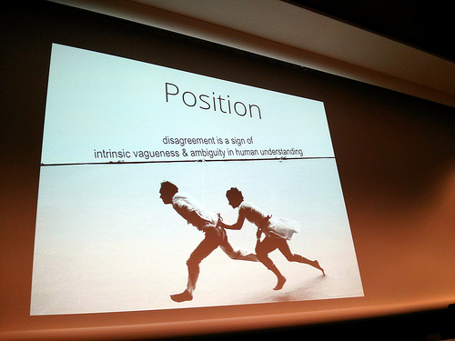
Photo by Cory Doctorow, Slides by Lora Aroyo

Photo by Cory Doctorow, slides by Lora Aroyo

I spent last week at Web Science 2013 in Paris. And what a well spent time that was. Web Science was for sure the most diverse conference I have ever attended. One of the reasons for this diversity is that Webscience was collocated with CHI (Human-Computer-Interaction) and Hypertext. But most importantly, the community of Webscience itself is very diverse. There were more than 300 participants from a wide array of disciplines. The conference spanned talks from philosophy to computer science (and everything in-between) with keynotes by Cory Doctorow and Vint Cerf. This resulted in many insightful discussions, looking at the web from a multitude of angles. I really enjoyed the wide variety of talks.

Nevertheless, there were some talks that failed to resonate with the audience. It seems to me that this was mostly due to the fact that they were too rooted in a single discipline. Some presenters assumed a common understanding of the problem discussed and used a lot of domain-specific vocabulary that made it hard to follow the talk. Don’t get me wrong: most presenters tried to appeal to the whole audience but with some subjects this seemed to be impossible.

To me, this shows that a better insight is needed on what Web Science actually is and more discussion on what should be researched under this banner. There seems to be a certain uncertainty about this, which was also reflected in the peer reviews. Hugh Davis, the general chair for Websci’13, highlighted this in his opening speech:

I think that Web Science is a good example where Open Peer Review could contribute to a common understanding and a better communication among the actors involved. I have been critical of open processes in the past because they take away the benefits of blinding. Mark Bernstein, the program chair, also stressed this point in a tweet:

Nowadays, however, I think that the potential benefits of open peer review (transparency, increased communication, incentives to write better reviews) outweigh the effects of taking away the anonymity of reviewers. Science will always be influenced by power structures, but with open peer review they are at least visible. Don’t get me wrong: I really like the inclusive approach to Web Science that the organizers have taken. The web cannot be understood with the paradigm of a single discipline, and at this very point in time it is very valuable to get input from all sides on the discussion. In my opinion, open peer review could help in facilitating this discussion before and after the conference as well.

Contributions

I made two contributions to this year’s Web Science conference. First, I presented a paper written together with Sebastian Dennerlein in the Social Theory for Web Science Workshop entitled “Towards a Model of Interdisciplinary Teamwork for Web Science: What can Social Theory Contribute?”. In this position paper, we argue that social scientists and computer scientists do not work together in an interdisciplinary way due to a fundamentally different approach to research. We sketch a model of interdisciplinary teamwork in order to overcome this problem. The feedback on this talk was very interesting. On the one hand participants could relate to the problem, but on the other hand they alerted us of many other influences to interdisciplinary teamwork. For one, there is often a disagreement at the very beginning of a research project about what the problem actually is. Furthermore, the disciplines are fragmented as well and have often different paradigms that they follow. We will consider this feedback when specifying the formal model. You can find the paper here and the slides of my talk below.

In general, the workshop was very well attended and there was a certain sense of common understanding regarding opportunities and challenges of applying social theory in web science. All in all, I think that a community has been established that could produce interesting results in the future.

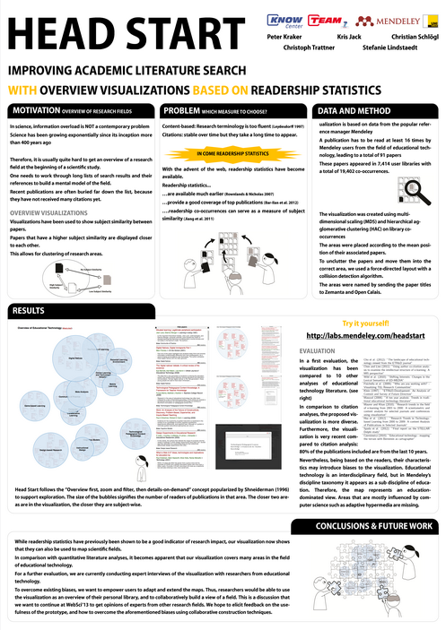
My second contribution was a poster with the title “Head Start: Improving Academic Literature Search with Overview Visualizations based on Readership Statistics” which I co-wrote with Kris Jack, Christian Schlögl, Christoph Trattner, and Stefanie Lindstaedt. As you may recall, Head Start is an interactive visualization of the research field of Educational Technology based on co-readership structures. Head Start was received very positively. Many participants were interested in the idea of readership statistics for mapping. There were some scientometrists but also educational technologists who expressed their interest. Many comments went towards how the prototype could be extended. You can find the paper at the end of the post and the poster below.

Head Start

Several participants noted that they would like to adapt and extend the visualization. Clare Hooper for example is working on a content-based representation of the field of Web Science, and it would be interesting to combine our approaches. This encouraged me even more to open source the software as soon as possible.

All in all, it was a very enjoyable conference. I also like the way that the organizers innovate in the format every year. The pecha kucha session worked especially well in my opinion, sporting concise and entertaining talks throughout. Thanks to all organizers, speakers and participants for making this conference such a nice event!

Citation
Peter Kraker, Kris Jack, Christian Schlögl, Christoph Trattner, & Stefanie Lindstaedt (2013). Head Start: Improving Academic Literature Search with Overview Visualizations based on Readership Statistics Web Science 2013

I haven’t blogged lately, mostly due to the fact that I was busy moving to London. I will be with Mendeley for the next four months in the context of the Marie Curie project TEAM. My first week is over now, and I have already started to settle in thanks to the great folks at Mendeley, who have given me a very warm welcome!

My secondment at Mendeley will focus on visualizing research fields with the help of readership statistics. A while ago, I blogged about the potential that readership statistics have for mapping out scientific fields. While these thoughts were on a rather theoretical level, I have been taking a more practical look at the issue in the last few months. Together with Christian Körner, Kris Jack, and Michael Granitzer, I did an exploratory first study on the subject. This resulted in a paper entitled “Harnessing Usage Statistics for Research Evaluation and Knowledge Domain Visualization” which I presented at the Large Scale Network Analysis Workshop at WWW’2012 in Lyon.

The problem

The problem that we started out with is the lacking overview of research fields. If you want to get an overview of a field, you usually go to an academic search engine and either type in a query or, if there has been some preselection, browse to the field of your choice. You will then be presented with a large number of papers. You usually pick the most popular overview article, read through it, browse the references, and look at the recommendations or incoming citations (if available). You choose which paper to read next and repeat. Over time, this strategy allows you to build a mental model of the field. Unfortunatly, there are a few issues with this approach:

  • It is very slow.
  • You never know when you are finished. Even with the best search strategy, you might still have a blind spot.
  • Science and Research are growing exponentially, making it very hard to not only get an overview, but also to keep it.

In come visualizations

Below you can see the visualization of the field of Technology Enhanced Learning developed in the exploratory study for the LSNA workshop. Here is how you read it: each bubble represents a paper, and the size of the bubble represents the number of readers. Each bubble is attributed to a research area denoted by a color – in this case either “Aadaptive Hypermedia” (blue), “Game-based Learning” (red), or “Miscellaneous” (yellow). The closer that two papers are in the visualization, the closer they are subject-wise. Morevoer, the further a paper is to the center of a field, the more central it is for that field. If you click on the visualization, you will get to a HTML5 version built with Google Charting Tools. In this interactive visualization, you can hover over a bubble to see the metadata of the paper.

Usually, visualizations like this one are based on citations. Small defined co-citations as a measure of subject similarity. The more often two authors or publications are being referenced in the same publication, the closer they are subject-wise. Using this measure in connection with multi-dimensional scaling and clustering, one can produce a visualization of a field. The co-citation measure is empirically well validated and has been used in hundreds, if not thousands of studies. Unfortunately, there a problem inherent of citations: they take a rather long time to appear. It takes three to five years before the number of incoming citations reaches its peark. Therefore, visualizations based on co-citations are actually a view of the past, and do not reflect recent developments in a field.

How to deal with the citation lag?

In the last few years, usage statistics have been a focus for research evaluation (see the altmetrics movement for example), and in some cases also visualizations. Usage statistics were not available, at least not on a large scale, prior to the web and tools such as Mendeley. One of the advantages of usage statistics in comparison to citations is that they are earlier available. People can start reading the paper immediately after publication, and in the case of pre-prints even before that. The measure that I used to produce the visualization above is the co-occurrence of publications in Mendeley libraries. Much like the possibility that two books, which are often rented from the library together, are of the same or a similar subject is high, the co-occurrence in libraries is taken as a measure of subject similarity. I took the Technology Enhanced Learning thesaurus to derive all libraries from that field. I then selected the 25 most frequent papers, and calculated their co-occurrences.

As this was our first study, we limited ourselves to only libraries from the field of computer science. As you can see, we were able to derive two areas pretty well: adaptive hypermedia, and game-based learning. Both are very important for the field. Adaptive hypermedia is a core topic of the field, especially with computer scientists; game-based learning is an area that has received a lot of attention in the last few years and continues to be of great interest for the community. You will also have noticed that there is a huge cluster labelled “Miscellaneous”. These papers could not be attributed to one research area. There are several possible reasons for this cluster: the most likely is that we did not have enough data. Another explanation is that Technology Enhanced Learning is still a growing field, with diverse foci, which results in a large cluster of different publications. Furthermore, we expect readership to be less focused than citations. This has on the one hand the possibility to show more influences to a field than citation data would, on the other hand too little focus will result in fuzzy clusters. To clarify these points, I am looking at the at the moment at a larger dataset, which includes all disciplines related to TEL (such as pedagogy, psychology, and sociology). Moreover, I am keen to learn more about the motivation of adding papers to one’s library.

In my view, visualizations based on co-readership bear a great potential. They could provide timely overviews, and serve as naviagtional instruments. Furthermore, it would be interesting to take snapshots from time to time to see the development of a field over the years. Finally, such visualizations could be useful to shed light on interdisciplinary relations and topical overlap between fields. These issues, and their relations to semantics will be the topic of another blogpost though. For the time being, I am curious about your opinions on the matter. How do you see visualizations? Could they be useful for your research? What would you like to be able to do with them in terms of features? I am looking forward to your opinions!

Citation
Peter Kraker, Christian Körner, Kris Jack, & Michael Granitzer (2012). Harnessing User Library Statistics for Research Evaluation and Knowledge Domain Visualization Proceedings of the 21st International Conference Companion on World Wide Web , 1017-1024 DOI: 10.1145/2187980.2188236